
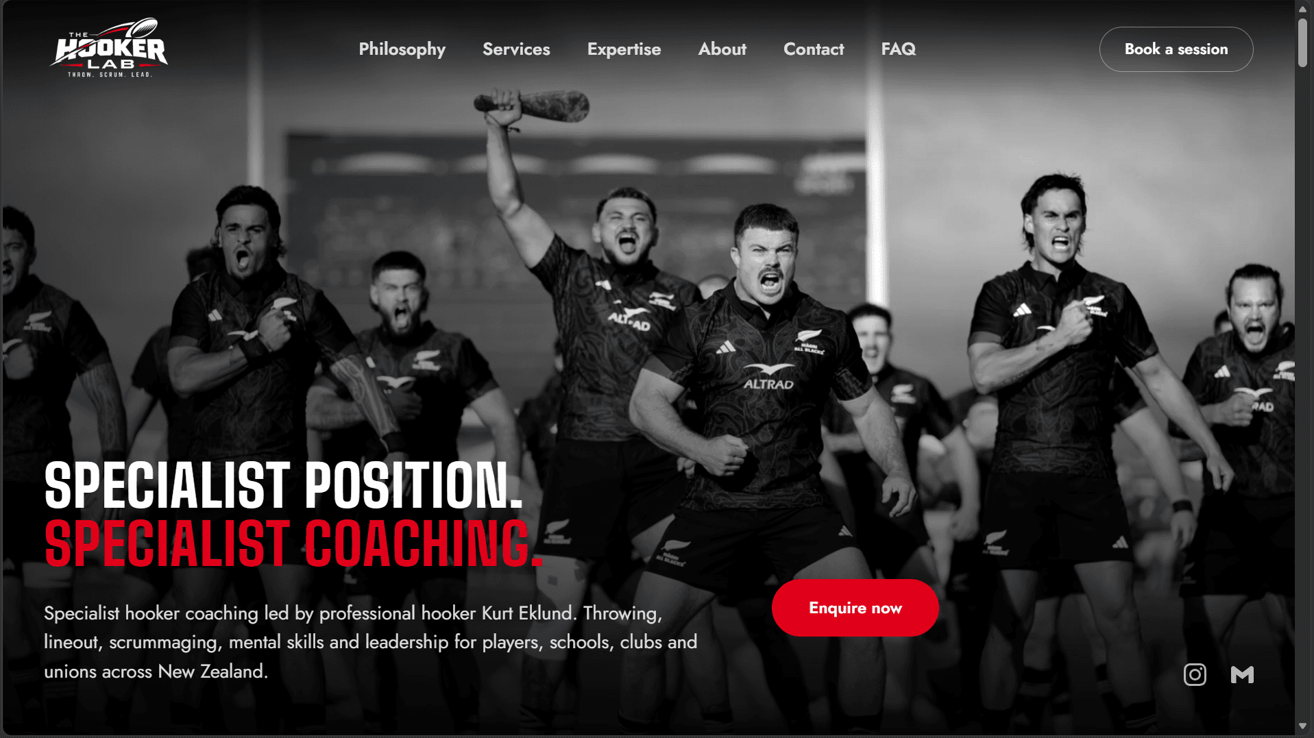
Most of my recent projects have been booking platforms and brochure sites for companies with a clear product. The Hooker Lab was a different kind of brief: a professional rugby player's coaching brand that had to read as a company, not a personal portfolio.
Kurt Eklund is a professional hooker with over a decade at the highest levels of New Zealand rugby. His new venture, The Hooker Lab, offers specialist coaching for one of the most technical positions on the field - to individual players, schools, clubs and provincial unions. The core idea is simple: hookers are specialists, and they deserve specialist coaching early. The website's job was to make that idea credible in a few seconds, then make it easy to act on.
The brand had to feel like an institution, not a profile
The logo gave me the whole palette: black, white and one strong red. I kept the red rare, so it only shows up where it should draw the eye. For type I paired a tall, condensed display face for headlines with a clean geometric sans for reading, which gave the site a strength-and-conditioning feel without looking like a gym template.
The hero is one black and white photograph, a headline and a short paragraph. That's all. I built two earlier versions with extra graphic elements and threw both away, because every addition made it look more generated and less confident. The Māori and haka influence comes through the photography itself, rather than through decoration layered on top of it, which felt like the more respectful choice.
Choosing and enquiring had to be the whole journey
Kurt's visitors are players, parents, coaches, schools and unions, and each arrives with a different need. So the workshops section is a small builder: pick who the session is for, pick the focus areas, and send an enquiry. The enquiry link carries those choices in the URL, and the contact form reads them, and opens already filled in. A school that chose "Schools" and two focus areas lands on a form that already knows what it's asking for.
It's the same query-parameter pattern I use on my own services page. It's a small detail, but it removes a full step between being interested and getting in touch.
A contact form that does the backend's job for it
The contact section is where most of the care went. There are seven enquiry types, and the fields adapt: a school is asked for its name, a player is asked about playing level, and a group is asked about size. If someone asks to be contacted on WhatsApp, the phone number becomes required. Errors say exactly what to fix, and a summary jumps to the first problem.
Behind the form sits one typed payload and one submit function. A hidden honeypot field filters out bots. Because the contract is defined up front, I could finish the entire front end while the backend team builds the admin panel and email routing separately and plugging it in later is a one-line change.
Specificity is the credibility
Kurt's story is told in specifics, not adjectives: the sides he has represented, his captaincies and his honors, set out as clean black tiles. The expertise section turns twelve skills into three pillars - Throw, Scrum and Lead - as expanding panels you explore one at a time. The testimonials sit in a single row when there are five or fewer, and a long quote gets a View more link instead of stretching its card.
The quiet pages matter too
The privacy policy, terms and refund policy share one template and one data file, and each page has a Download PDF button. The PDF is generated in the browser from the same data as the page, so the two can never drift apart. Add SEO from day one (structured data, a sitemap, a robots file that keeps staging out of search), and a custom 404 in the rugby spirit - "Knock-on. Nothing here." - and the site feels finished in the places most people never look.
What I'd take from it
A specialist niche makes the design job easier, not harder. When the client is certain about who the site is for and what each visitor should do next, every section gets exactly one job. The animation, built with GSAP and Motion on top of Next.js and Tailwind, only works because that structure was already clear.
You can see the live site at thehookerlab.co.nz.